DALLAS — One of the early storylines of baseball spring training has been a very baseball storyline: What's up with the jerseys?
More specifically, what's up with the stitching and the font size of the name and how it's curved across the back of the jersey?
These are the questions that immediately bubbled to the surface as Major League Baseball teams opened spring camps this month. The typically-standard mid-February clubhouse media scrums turned into a "What are those???" session, as players and media alike got a look at the newly-tailored jerseys for 2024.
Paul Lukas, who covers all things uniforms for Uni Watch, dove into some of the backlash, including reports out of the Cardinals' camp that the new threads looked "cheap."
Lukas also parsed through some of the reasons behind the changes; many fans blamed jersey manufacturer Fanatics, but it was Nike that provided the design specs.
In any case, with teams hitting the practice fields over the last week, we've gotten a look at the new jerseys in action, on actual baseball players and not hanging in a locker.
For the Rangers, three things seem to stand out: The size of the name lettering on the back of the jerseys, the curvature and spacing of the lettering, and the distance between the lettering and the Major League Baseball logo at the top of the collar.
Think any or all of those things are minor details? Perhaps. Baseball Twitter has other opinions, though.
So let's break down the key differences we've seen in the Rangers' jerseys specifically:
Lettering size
The size of the lettering will be the first thing fans likely notice on the new jerseys. The letters also appear to be spaced further apart than last year's jerseys. Here are a couple before-and-after examples, starting with Adolis Garcia:
AP photo from September 2023:

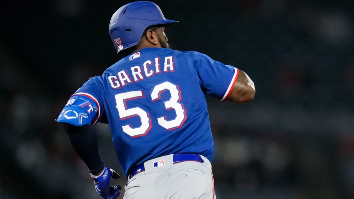
And now, from spring training this week, via the Rangers:


The lettering font, drop shadow and colors all appear the same. But the font size is much smaller.
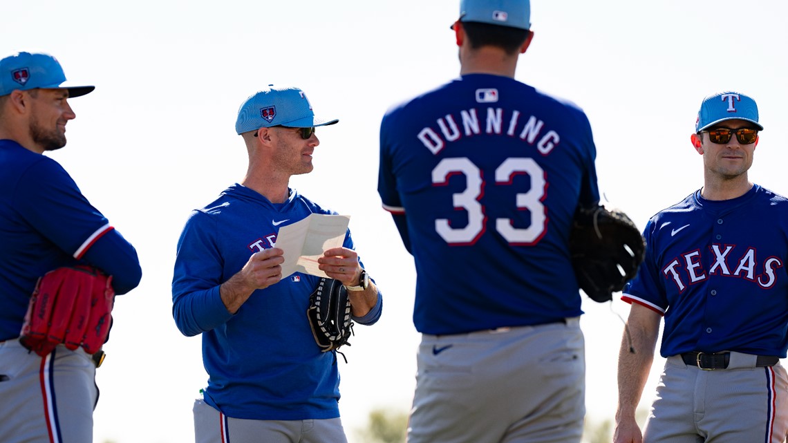
Lettering curve
The curve of the lettering will also be apparent to fans. Here's an example via pitcher Dane Dunning that shows the distinct difference between the old design and this year's new look.
AP photo from 2022:

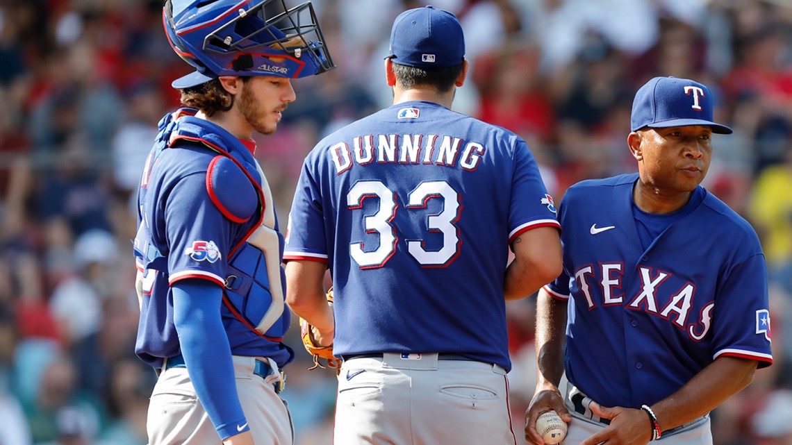
And then from this week, via the Rangers:

MLB logo placement
The last key difference that might not be spotted immediately -- but is certainly apparent when looking at side-by-side photos -- is the placement of the MLB logo lower on the back of the jersey.
Here's a look at last year's logo placement on Ezequiel Duran's jersey, as he watched Garcia celebrate a homer.


And then note the lower logo placement on this year's jerseys:

What's still the same?
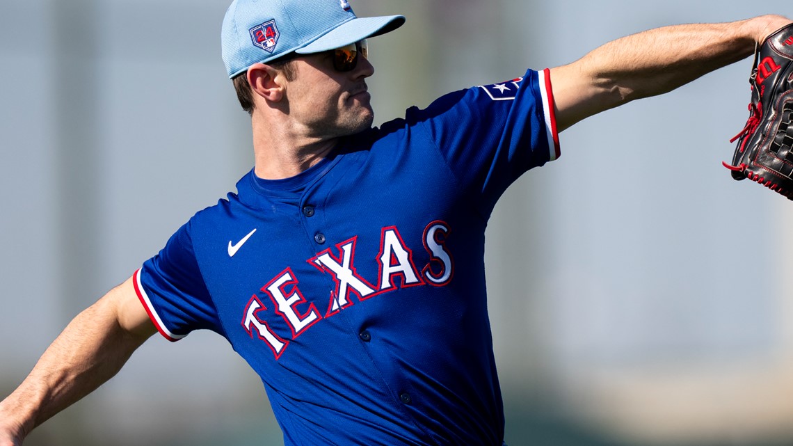
For what it's worth, while there's been some hand-wringing over the stitching of the new jerseys, the front of the jerseys look mostly identical to last year's.
From 2023, via AP:


And from spring training this week, as worn by newly-acquired reliever David Robertson: